Okay, here’s something for the non-comic book readers (or those not too familiar with comics) to try out.
– Think about your favourite drama/tense thriller style film.
– Now, replace the best actors of that film and re-dub their voices with someone entirely inappropriate. Let’s say, Pee-Wee Herman (assuming your favourite film isn’t Big Top Pee-wee). You can do this with either your imagination or, if you’re so inclined, Pee-Wee Herman.
Chances are, even in this hypothetical scenario, the film wont be quite the same, or even be a favourite of yours any more (unless you actually like Pee-Wee Herman), despite the fact that the only real thing which has changed is the delivery of the script. The same holds true of the dubbing or subtitling/translation of any movie – the original script may be brilliant and the acting sublime, but a poor effort in communicating any of that can kill a story.
For comics, lettering has that level of significance and importance.
Lettering, for all intents and purposes, is the ‘voice’ of the comic pages. It’s a bit like prose in the sense that you’re given a set amount of information about the character, while your imagination fills in the gaps – but where comics changes that is through its use of dynamic lettering. A letterer will often visually show you if the character is shouting, whispering, thinking, has a slightly inhuman voice and so on. You still have to use your imagination to decode and personalise this information, but it’s a unique combination of presentation and reader input that creates the effect. Not only that, but colour, size, font style, and the placement of the words themselves all factor into this.
If done right, it’s an invisible, almost under-appreciated art. A good letterer, like a good editor, will let you pass through a story without you thinking too much, if anything, about the job being done. But it’s utterly vital to the story – because when it’s bad, it stands out like a large, sore, diseased thumb.
I’m talking about this now for two reasons. The first is because the opening chapter of Butterflies and Moths is currently being lettered, and thankfully Jen is not only a sterling artist, but has a natural flair for lettering as well. There are a still a few tweaks to be made as we make some adjustments and decisions, but so far it’s looking great.
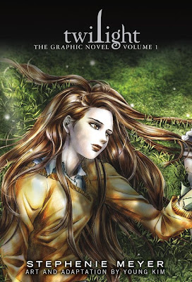
The second reason is due to the much maligned Twilight graphic novel which has just been released. The book’s story/art/content aren’t the reason why it’s taking a critical beating, but rather the lettering.
Now, while I don’t subscribe to “this is The Worst Lettering in the World Ever” train of thought as some have dubbed it (simply because people who don’t usually read comics won’t see half the stuff a regular comics reader will see), it’s still a classic example of just how important the craft is. Take the page above (click to expand it).
The speech balloons are too big for the words inside them – when a word as small as “oh” takes up a tiny space in the middle of a giant balloon it’s a bad move, but what makes it worse is it takes up so much room to have an effect on the following balloon (spoken by the teacher in the scene) which is slanted at an angle for no discernible reason, needlessly overlapping the next balloon. It’s a mess of placement and reading flow, and makes it look like they just stuck them on the page in a rush.
From most of the pages I’ve seen, this continues:

Again, poor placement covers up the art where it doesn’t need to, the balloon is way too large for the text, and so on. Comics Alliance does a good run-down of the book’s mistakes here, but for such a massive title and given the large following Twilight has (not to mention the lovely art the book is blessed with), it’s a shame it falls down so hard on one of the most important parts.
For a point of comparison, I’d consider the following a good page of lettering (courtesy of DC Comics’ brilliant Fables series – click to enlarge it):

Simple, elegant and doesn’t get in the way of the story (by neither covering up much of the art or being difficult to read).
So, catch you in a few for a lettered preview of Butterflies and Moths – hopefully we’ve done a good job on making it easy to read… or at least easier to read than Twilight…
< Go Back